Methods of iterating
In this project, I explore how Tarot archetypes can be translated into the language of contemporary visual design through stock imagery. I am creating a structured catalogue in which each Tarot card is linked to specific stock images and organised into groups based on elements, descriptions, and narrative structures. The goal is to treat Tarot not as mysticism, but as a universal symbolic framework for storytelling and emotional communication, while also approaching the project with production-aware thinking
Written response:
DRAFT 1: /////////////////////////////////////////////////////////////////////////////////////////////////////////////////////////////////////////////////////////////i
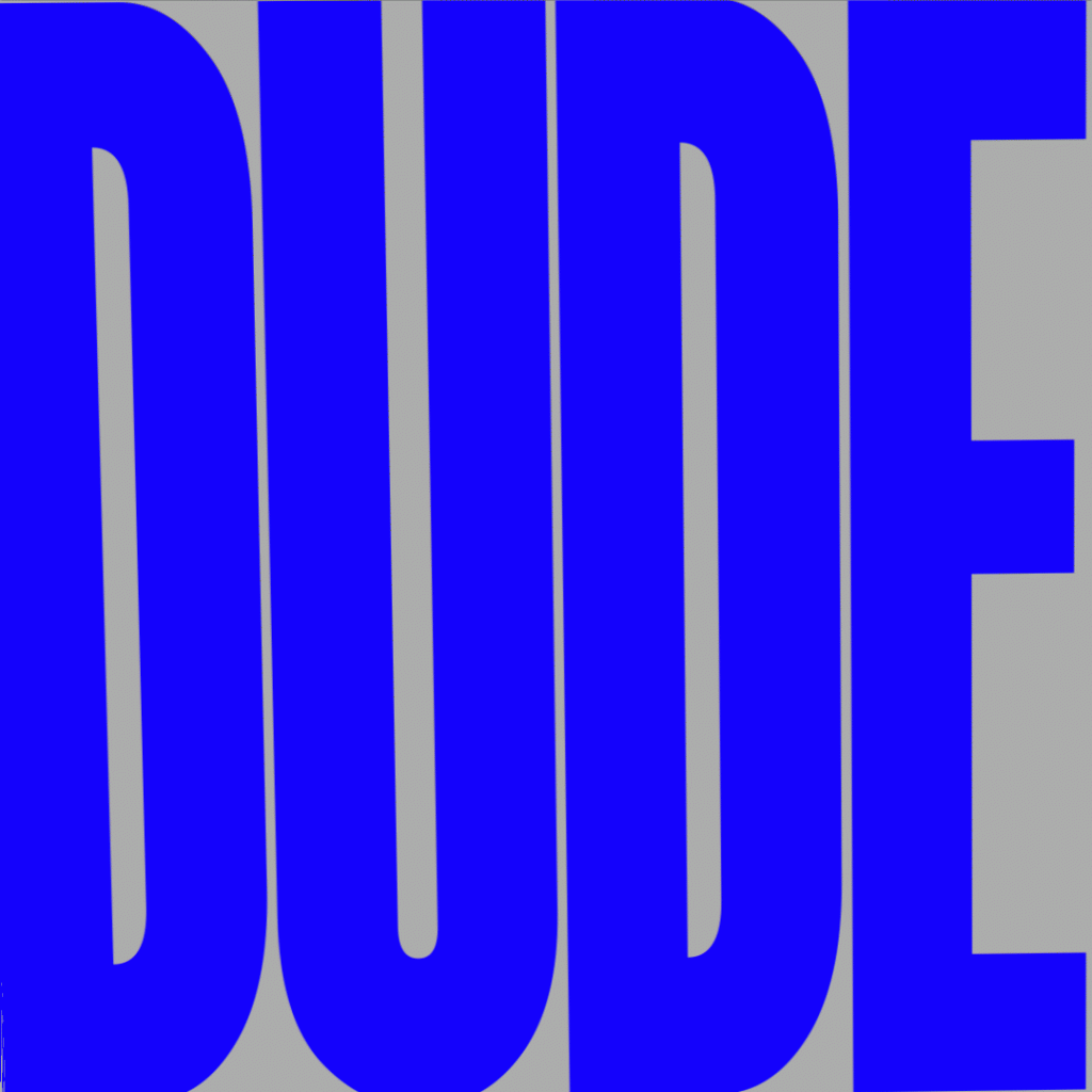
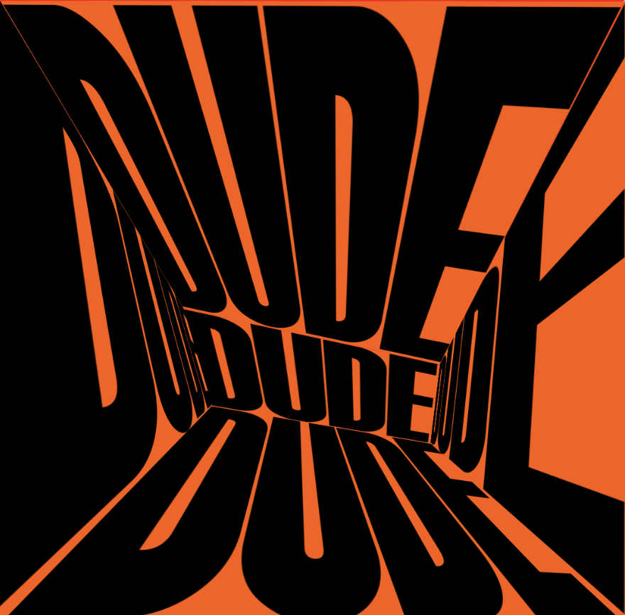
In the first weeks of the project, I began to work with kinetic typography and motion graphics. U based their structure on rhythm and sound. My main question was: How typography behaves when it operates in time rather than as a static composition. I used After Effect as my main software to expand this question and copy the chosen Studio Dunbar DEMO Festival fragment. Gradually, the morphing tool in After Effects became central to my process. Instead of using it for seamless transitions, I began to “hack” it by exposing its mechanics and breaking its logic as same as the logic of smooth transition.
Through this experimentation, I emerged several critical questions : When does typography stop communicating and begin performing? If motion structures perception, can style overpower semantic clarity?
To explore these questions further, I propose a studio-based experiment structured around controlled deformation. I structured my work around deformation experiments. I chose the single word or letter to create a sequence of iterations in which morphing progressively disrupts readability. I aim to have no aesthetic refinement, but a work, that examine how style—through motion and pressure—redefines what language does.
DRAFT 2: ////////////////////////////////////////////////////////////////////////////////////////////////////////////////////////////////////////////////////////////
I chose Susan Sontag’s essay On Style as my main reference from the reading list. I found her essay to be a representation of the critical framework for understanding the evolution of my project. During my second week experimental stages, I approached morphing as a technical experiment to test how the tool behaves when it been hacked. However, Sontag’s argument that style is not separate from content reframes this approach. In her essay, she insists that style is not decoration added to meaning, but it is the way meaning exists in work.
As the project developed, I shifted from abstract distortions to working with colloquial forms of address such as “girl,” “bro,” and “dude.” I represent this words function not as neutral descriptors but as direct modes of address. When they were animated through repetition and deformation, their semantic clarity begins to weaken. And, according to Sontag’s perspective, this weakening is not a loss. Instead, the stylistic dimension becomes more visible and unique. It’s now focused on the word’s rhythm, identity, and spatial behaviour. Morphing transforms typography into a physical object. Letters stretch, resist, and collapse.
I began asking: When does a word cease to function as language and begin to operate as material form? If style is inseparable from content , what happens when style destabilises legibility? These questions align with Sontag’s emphasis on surface and sensuous experience. Rather than interpreting the word, the viewer encounters it materially and personality.
To conclude, through Sontag’s lens, my work shifts from being about technical failure to being about style as force. Morphing becomes a way to reveal how form structures perception. The project is no longer about breaking language, but about exposing how style reorganises its presence.
DRAFT 3: ////////////////////////////////////////////////////////////////////////////////////////////////////////////////////////////////////////////////////////////
For the third draft, I reduced the text to two words: STYLE and CONTENT. Instead of animating a full passage from Sontag, I chose to render her central claim — that style is inseparable from content — through motion. In the animation, the two words morph and share structural elements. They cannot exist independently; each form emerges through the transformation of the other. By limiting the text to two words, I remove interpretation and focus on surface and behaviour. The loop structure reinforces the idea that style and content are mutually constitutive. This translation aligns with Sontag’s emphasis on sensuous experience: the relationship between style and content is demonstrated through visual instability rather than discursive explanation.
References:
1. ‘On Style’ Against Interpretation and Other Essays; London: Penguin [1965] 2009 pp. 15–36 http://www.coldbacon.com/writing/sontag-onstyle.html.
2. Reinfurt, D. (2019). A *new* program for graphic design. Los Angeles: Inventory Press ; New York, Ny; david-reinfurt-a-new-program-for-graphic-design-inventory-press_d.pdf. [online] Available at: https://www.are.na/block/26737861 [Accessed 2 Mar. 2026].