
Methods of cataloguing
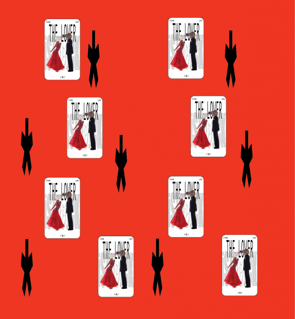
In this project, I explore how Tarot archetypes can be translated into the language of contemporary visual design through stock imagery. I am creating a structured catalogue in which each Tarot card is linked to specific stock images and organised into groups based on elements, descriptions, and narrative structures. The goal is to treat Tarot not as mysticism, but as a universal symbolic framework for storytelling and emotional communication, while also approaching the project with production-aware thinking
Written response:
For this project written response, I chose the following fragment from the article Fuck Content by Michael Rock. In order to analyse it, I’m going to use Metadata method of cataloguing.
Fuck Content
“Back when Paul Rand wrote “There is no such thing as bad content, only bad form,” I remember being intensely annoyed. I took it as an abdication of a designer’s responsibility to meaning. Over time, I have come to read it differently: he was not defending hate speech or schlock or banality; he meant that the designer’s purview is to shape, not to write. But that shaping itself is a profoundly affecting form. (Perhaps this is the reason that modern designers—Rand, Munari, Leoni—always seem to end their careers designing children’s books. The children’s book is the purest venue of the designer/author because the content is negligible and the evocative potential of the form unlimited.)
So what else is new? This seems to be a rather mundane point, but for some reason we don’t really believe it. We don’t believe shaping is enough. So to bring design out from under the thumb of content we must go one step further and observe that treatment is, in fact, a kind of text itself, as complex and referential as any traditional understanding of content.
A director can be the esteemed auteur of a film he didn’t write, score, edit or shoot. What makes a Hitchcock film a Hitchcock film is not the story but a consistency of style, which winds intact through different technologies, plots, actors, and time periods like a substance of its own. Every film is about filmmaking. His great genius is that he is able to mold the form into his style in a genuinely unique and entertaining way. The meaning of his work is not in the story but in the storytelling.
Designers also trade in storytelling. The elements we must master are not the content narratives but the devices of the telling: typography, line, form, color, contrast, scale, weight. We speak through our assignment, literally between the lines.
The span of graphic design is not a history of concepts but of forms….”
Metadata:
Name: Metadata of the Article “Fuck Content” (Michael Rock)
Basic Information —————————->
- Author: Michael Rock
- Title: Fuck Content
- Year of Publication: 2009
- Source: 2×4.org (link to website)
- Type of Text: Essay / Critical article on design
- Language: English
- Length: 324 words ( full~1500 words )
- Target Audience: Designers, design students, creative professionals
Content Metadata —————————->
Main Argument: Desighn > Context
“The span of graphic design is not a history of concepts but of forms.”
Key Themes:
- Form over Content
- Design as Storytelling
- Authorship in Form (Hitchcock example)
- Form Skepticism
- Children’s Books as Pure Design *****
Contextual Metadata:
- Historical Context: Late 20th / early 21st-century
- Cultural Context: Reflects debates about the role of authorship in design
- Philosophical Context: Designers don’t have to create the “meaning” of the content, the form instead can communicate meaning on its own.
- Inspirational References: (Children’s book, Hitchcock, Paul Rand, Munari, Leoni)
Grammatical and Structural Features: (look at the text)————->
- Frequent contrasts
- Repetition of key phrases
- Rhetorical questions
- Direct addresses to the reader
Most repeated Words:
| design / designer / designing | 10 |
| form / shaping / shape | 8 |
| content | 6 |
| story / storytelling | 5 |
| meaning | 4 |
| style | 3 |
Reflection:—————————>
In his article, Michael Rock argues that meaning does not necessarily arise from content, but rather from shape, structure and visual language. I agree with the author. Yes, visuals or design solutions can sometimes lack depth, however I disagree that they can be described as ’empty and spineless’. Their purpose is to captivate visually and offer a straightforward experience without any depth.
My tarot catalogue operates in a similar manner: each card is assembled from stock photographs whose original meaning has been lost and rendered absurd.Their combination and sequencing leads to the emergence of new narratives, not through content, but through visual resonance, irony and coincidence. The functionality of tarot cards is simple: to predict the future. I have no recourse to history in order to provide a foundation for my project, yet I am able to draw upon a certain kind of mysticism, absence of rationality and logic.
Reference list
1. Rock, M. (2009). Fuck Content — 2×4. [online] 2×4. Available at: https://2×4.org/ideas/2009/fuck-content/.
2. Foucault, M. (1980). The Order of Things._fields.
3. David Campany. (2013). Marianne Wex: Let’s Take Back Our Space. [online] Available at: https://davidcampany.com/marianne-wex-lets-take-back-our-space/.